` element
Simon Pieters @zcorpan
---
## About me
* Opera, 2007
* Office in Linköping
* Live in Örebro
???
I worked mainly on quality assurance for the Presto engine,
until 2013 when we switched to Chromium.
Now I work full time on web standards, but also contribute to web-platform-tests,
a set of testsuites that are shared across all major browser vendors.
---
class: light


## Editor of web standards
* WHATWG: HTML, Quirks mode
* RICG: The `picture` element (now WHATWG)
* W3C: CSSOM, CSSOM View, Geometry APIs, WebVTT
???
I co-edit the HTML standard at the WHATWG.
I helped drive the `picture` element spec. It's now part of the HTML standard.
At the W3C I edit the CSS object model specs.
---
class:light
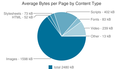
## Images & performance
😭
Source: httparchive.org
???
The performance aspect I want to talk about today is the amount of bytes that go over the wire.
This data is publicly available, called HTTPArchive.
A crawler fetches 500,000 top pages using Chrome and collects various data, can then be queried
with BigQuery.
2/3 of the bytes of the average Web page is image data.
The HTML and CSS are thin slices.
**CLICK**
What can we do to reduce bytes from images?
---
## Use CSS instead of images
* border-radius
* text-shadow
* box-shadow
* gradients
* blend modes
* filter, backdrop-filter
???
In some cases images are used, but the desired effect can be achieved with CSS.
For example buttons with rounded corners and a gradient.
Blend modes, may be familiar to those in Photoshop...
---
class: light
## Filter &Blend mode
???
Just to demonstrate filters and blend modes.
There are more filters than blur; brightness, contrast, drop-shadow, grayscale, etc.
Also more blend modes; lighten, darken, saturation, luminosity, etc.
These are particularly useful to use on images, e.g. for hover effects, or text on images.
---
## Use SVG
* Generally less bytes
* Is scalable
* Can be accessible
* Can be animated
* Can be scripted
* Can use media queries
* Inline, ``, background-image...
???
For some kinds of images it makes sense to use SVG. Icons, logos...
Interactive things like an image map can also be done with SVG, with embedded links.
SVG can use media queries in CSS, to make the image adapt to different viewport sizes.
An icon might benefit from less detail at very small sizes.
SVG can be used wherever an image can be used, or inline in the HTML.
---
## Provide different images
* pixel density
* screen size
* page layout
* format support
???
So now we're left with images that we can't "convert" to to CSS or SVG. Like photographs.
It's possible to save bytes by providing alternative images, depending on...
Let's take a closer look at each of these in turn.
---
class:light
## High resolution screens
Illustration from WHATWG HTML spec
???
A few years ago, mobile devices and computer screens started to have more pixels per inch, or higher DPI.
So suddenly, all images started to look bad compared to text. Especially images of text.
Solution is to use bigger images and scale them down to 50%.
But the problem is that it increases the byte size of the images by about 4x if quality is the same.
---
class: light
## File size & compression ratio
Source: flif.info
???
Let's do a case study of this sample image, taken from flif.info.
The original image is in PNG and doesn't have lossy artifacts.
---
class: light
## File size & compression ratio
Image
Dimensions
Quality
File size
original.png
1306x870
1.7 MB
half-size.png
653x435
466 KB
half-size.jpg
653x435
Medium
51 KB
original.jpg
1306x870
Medium
158 KB
😭
Tool used: https://imageoptim.com/mozjpeg
???
The original PNG is pretty big, 1.7 MB.
I scaled it down to 50% with GIMP and used "Save for Web" as PNG.
I then used an online tool, imageoptim.com, to convert those to JPEG.
The half size one is 51 KB, and the original size one is 158 KB, about 3 times as big.
**CLICK**
We can't have that.
---
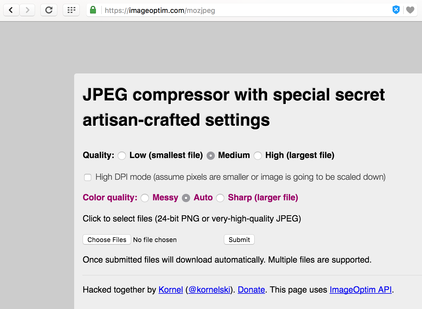
👉
???
Looking again at this online tool, it has a checkbox for High DPI mode.
It tweaks the quality knobs down a bit, knowing that the image is going to be scaled down.
We can also choose "low" quality for the original size image, and see what happens.
---
class: light
## File size & compression ratio
Image
Dimensions
Quality
File size
original.png
1306x870
1.7 MB
half-size.png
653x435
466 KB
half-size.jpg
653x435
Medium
51 KB
original.jpg
1306x870
Medium
158 KB
original@2x.jpg
1306x870
Low & High DPI mode
76 KB
😌
Tool used: https://imageoptim.com/mozjpeg
???
Now it's 76 KB!
**CLICK**
Much better. Almost the same byte size as the one that's half pixel size.
But wait, if it's lower quality, won't it look horrible?
---
class: light
## Artifacts are scaled down, too
???
It turns out that it doesn't.
This is because the artifacts are also scaled down, so they're not as noticeable.
The one on the left is the medium-quality original-size JPEG.
The one on the right is the low-quality, High DPI mode, original-size JPEG.
---
## srcset x
```html
```
???
So we have two images we want to provide.
The half size medium quality JPEG for low-resolution screens.
The original size low quality JPEG for high-resolution screens.
In the HTML we use the smaller image in the src attribute.
And the bigger image in a new attribute called srcset. After the URL is a "2x" descriptor.
The browser then decides which of these to download, based on the user's screen pixel density and preferences.
---
class: light
## Flexible images
Illustration from WHATWG HTML
???
Next up is flexible images.
Sometimes you may want an image to always fill the entire viewport width.
Providing just one big image is going to be a waste of bytes for users with small screens or screens with low DPI.
---
class: light
## Which image is suitable?
Small viewport
Big viewport
Low DPI
small image
big image
High DPI
big image
crazy big image
???
So how do we determine how big an image should be downloaded?
There are two axes -- viewport size and screen DPI.
---
## Let the browser do the math
* Browser knows the screen's DPI
* Browser knows the viewport size
???
Instead of trying to write media queries to figure this out as a web developer, it's better to leave it to the browser.
The browser knows the screen DPI and the viewport size.
It just needs to know the images' widths and the intended layout width of the image.
---
class: light gray
Source: https://ericportis.com/posts/2014/srcset-sizes/
???
You provide this information with the srcset and sizes attributes.
This image comes from a tutorial from Eric Portis, well worth reading!
---
## srcset w & sizes
```html
```
???
Let's break this down.
In src we provide the fallback image.
---
class:light
## srcset: w descriptor
* Pixel width of the image data
Image
Dimensions
srcset descriptor
small.jpg
320x160
320w
medium.jpg
640x320
640w
large.jpg
1024x512
1024w
???
In srcset we provide different URLs, and a w descriptor, giving the image pixel width.
---
## sizes: vw CSS unit
* Percentage of the viewport width
```css
#banner img { width:100% }
```
```html
```
???
In sizes we provide the image's intended layout size.
In this case we want it to fill the viewport, so 100vw. vw is percentage of viewport width.
Why is this necessary? The browser wants to start loading an image before it has downloaded the CSS.
So it doesn't know the layout yet. With the sizes attribute you give the browser a hint about the layout.
So it can calculate the effective pixel density and choose a URL from srcset.
---
## Flexible images with maximum width
```css
#banner img { width:640px; max-width:100% }
```
```html
```
???
A common case is to want an image to shrink to fit the viewport, but then don't grow bigger than a certain size.
This is effectively a layout breakpoint.
We can describe several layout widths in the sizes attribute: first a media condition, then a CSS length.
Finally a default CSS length.
If the viewport is bigger than 640px, the image should be 640px wide.
Otherwise it should be 100% of the viewport width.
---
class:light
## Flexible images & layout breakpoints
Illustration from WHATWG HTML spec
???
Let's look at a more complicated example. This has 3 different layouts.
1 column for narrow viewports. 2 columns for medium viewports. 3 columns with some margin for wide viewports.
Note that the image is the smallest on the medium viewport. So it's not bigger viewport = bigger image.
Between these layout breakpoints the images are flexible.
---
## Breakpoints in sizes
```html
```
???
If the viewport is smaller than 30em, let the image fill the viewport. 1 column.
Otherwise, if the viewport is smaller than 50em, let the image take up half the viewport. 2 columns.
Otherwise, let it take up a third of the viewport minus 100px (for margin). 3 columns.
srcset is the same as before; URL and w descriptor.
The browser evaluates the sizes attribute and gets a single layout width,
then divides each w descriptor with the layout size, to get an effective "x" descriptor.
Then the browser picks a URL in srcset to download based on the user's screen pixel density and preferences.
---
class:light
## Art direction
Illustration from WHATWG HTML spec
???
So far we've only looked at images that just scale up or down.
Sometimes you may want a completely different image in different layouts, or just crop the image.
It's not necessary to download the full image if you are just going to display a crop.
---
## picture & source media
```html
```
???
To do this we need to bring in the picture element and the source element.
When picture is used, the browser goes over the list of source elements preceding the img element,
and the img element itself, to find a candidate element.
The media attribute takes a media query, like in CSS. If it evaluates to false, the source element is skipped.
The source element in picture can only use srcset attribute, not the src attribute.
But you can use just a single URL in srcset. No descriptor is the same as 1x.
When the user resizes the window or rotates the device, the browser re-evaluates the img element.
---
class: light
## Save bytes with other image formats
Source: flif.info
???
Let's talk about image formats.
Some formats compress some kinds of images better than others...
But the point of this slide is to point out that new image formats are being developed.
---
class: light
???
FLIF is a cool new format that is not yet supported in any browser.
When it is supported it might make some of the HTML markup unnecessary...
---
class: light
## Image format support
Format
IE
Edge
Firefox
Chrome
Safari
Opera
iOS Safari
Opera Mini
Android Browser
Chrome for Android
WebP
11
14
49
53
10
39
10
all
52
51
JPEG XR
11
14
49
53
10
39
10
all
52
51
JPEG 2000
11
14
49
53
10
39
10
all
52
51
Source: caniuse.com
???
But some browsers do support more formats than just JPEG/PNG/GIF today.
Unfortunately none of them are supported everywhere.
It could make sense to provide WebP for Chrome and Opera, JPEG XR for IE and Edge, and JPEG as fallback.
---
## picture & source type
```html
```
???
To do that we use the type attribute on the source element.
The browser goes over the list of source elements in order and checks the type attribute.
If the MIME type is not supported, it skips to the next source or img element.
If both source elements are skipped, the img element is used, and there we give the JPEG version.
So now you can use new image formats on the Web without waiting for universal browser support.
---
## Everything together
```html
```
Source: https://dev.opera.com/articles/responsive-images/
???
You can combine all of these use cases in a single picture element.
Unfortunately it means a bit of repetition and it looks ugly.
It's still a saving, byte-wise, because image data is the big slice, and HTML is the small slice.
You can't combine x descriptor with w descriptor in srcset, however.
w descriptor is normalized into an x descriptor. The browser takes screen pixel density into account in both cases.
---
class: light
## Support for the `` element
IE
Edge
Firefox
Chrome
Safari
Opera
iOS Safari
Opera Mini
Android Browser
Chrome for Android
11
14
49
53
10
39
10
all
52
51
Source: caniuse.com
???
So what is the support like?
Today it's pretty good; implemented across all major rendering engines.
---
## What about IE 11 and Opera Mini?
* `` is used for fallback
* or picturefill can be used
???
So what if you care about IE users or Opera Mini users?
The img element is required, so you always have a fallback image for browsers that don't support picture.
There's also a good polyfill called picturefill that can be used.
---
class: light
???
Let's have a look at how Opera Mini works.
---
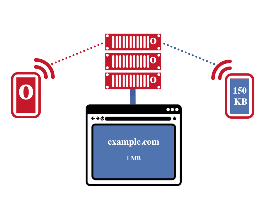
class: light
???
Opera Mini is a proxy browser.
A browser is running in Opera's proxy server. The proxy server requests your web page.
It will then send a compressed version to the client.
Why should you care about Opera Mini? How many are using it, and why?
---
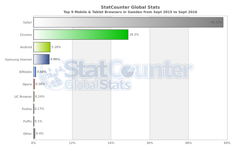
???
In Sweden it's relatively few people mobile/tablet users are using Opera Mini.
We have high-end phones and good Internet, so things work OK.
---
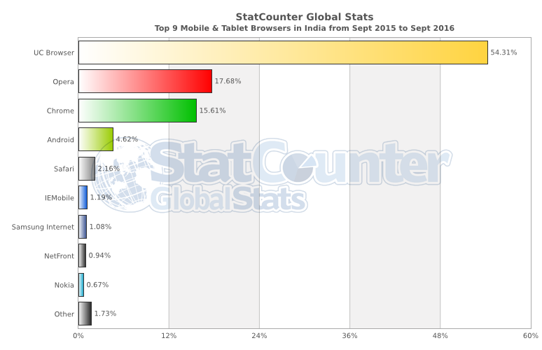
???
In India, Opera is the second biggest mobile/tablet browser.
---
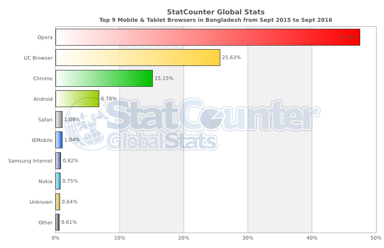
???
In Bangladesh, Opera is the biggest mobile/tablet browser, about 50% of the market share.
Internet is slow and expensive, so Opera Mini makes the Web work affordable and at all for these users.
Globally Opera Mini has over 300 million users.
---
## Design for Opera Mini
* https://dev.opera.com/articles/making-sites-work-opera-mini/
* Send HTML, don't rely on scripts
* Use SVG instead of icon fonts
* Gradients, rounded corners are disabled
???
There's a tutorial on dev.opera.com on how to make your page work in Opera Mini.
Making your site work in Opera Mini doesn't just have the benefit that your site works for Opera Mini users.
It can also make it perform better for everyone, make it more robust, more accessible, etc.
---
class: light
## Test in Opera Mini
* iOS: O -> Opera Mini
* Android: O -> Savings mode: Extreme
* Opera Mini on desktop
???
To test Opera Mini, on iOS it is enabled in the "O" menu.
On Android you flip on Savings mode in the "O" menu.
There's also an Opera Mini application for desktop computers, for testing.
---
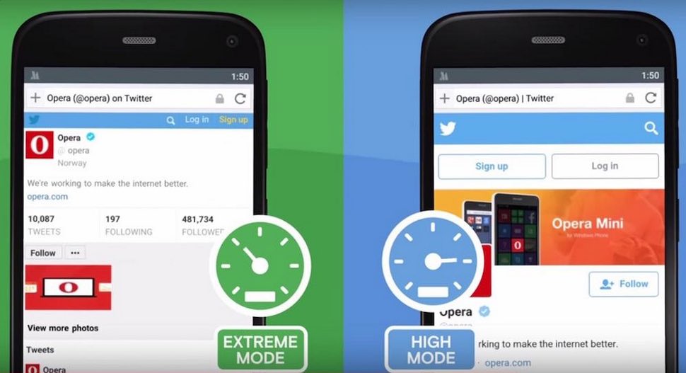
???
On Android there are two savings modes, high and extreme.
---
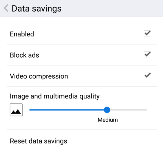
## Opera's "High" data saving mode
* Chromium on client
* HTTP2 connection to Opera proxy
* Images are compressed/transcoded
* Usually doesn't break things
---
## Opera's "Extreme" data saving mode
* Presto on proxy server
* OBML sent to client
* Scripts run on the server ~30s
* Web fonts, gradients, rounded corners disabled
---
---

## Opera Max on Android
Compress videos and images for almost all apps
---
# Thanks!
@zcorpan
simonp@opera.com
zcorpan.github.io/webperf2016
 ## Editor of web standards
* WHATWG: HTML, Quirks mode
* RICG: The `picture` element (now WHATWG)
* W3C: CSSOM, CSSOM View, Geometry APIs, WebVTT
???
I co-edit the HTML standard at the WHATWG.
I helped drive the `picture` element spec. It's now part of the HTML standard.
At the W3C I edit the CSS object model specs.
---
class:light
## Images & performance
## Editor of web standards
* WHATWG: HTML, Quirks mode
* RICG: The `picture` element (now WHATWG)
* W3C: CSSOM, CSSOM View, Geometry APIs, WebVTT
???
I co-edit the HTML standard at the WHATWG.
I helped drive the `picture` element spec. It's now part of the HTML standard.
At the W3C I edit the CSS object model specs.
---
class:light
## Images & performance


 ???
Let's have a look at how Opera Mini works.
---
class: light
???
Let's have a look at how Opera Mini works.
---
class: light
 ???
Opera Mini is a proxy browser.
A browser is running in Opera's proxy server. The proxy server requests your web page.
It will then send a compressed version to the client.
Why should you care about Opera Mini? How many are using it, and why?
---
???
Opera Mini is a proxy browser.
A browser is running in Opera's proxy server. The proxy server requests your web page.
It will then send a compressed version to the client.
Why should you care about Opera Mini? How many are using it, and why?
---
 ???
In Sweden it's relatively few people mobile/tablet users are using Opera Mini.
We have high-end phones and good Internet, so things work OK.
---
???
In Sweden it's relatively few people mobile/tablet users are using Opera Mini.
We have high-end phones and good Internet, so things work OK.
---
 ???
In India, Opera is the second biggest mobile/tablet browser.
---
???
In India, Opera is the second biggest mobile/tablet browser.
---
 ???
In Bangladesh, Opera is the biggest mobile/tablet browser, about 50% of the market share.
Internet is slow and expensive, so Opera Mini makes the Web work affordable and at all for these users.
Globally Opera Mini has over 300 million users.
---
## Design for Opera Mini
* https://dev.opera.com/articles/making-sites-work-opera-mini/
* Send HTML, don't rely on scripts
* Use SVG instead of icon fonts
* Gradients, rounded corners are disabled
???
There's a tutorial on dev.opera.com on how to make your page work in Opera Mini.
Making your site work in Opera Mini doesn't just have the benefit that your site works for Opera Mini users.
It can also make it perform better for everyone, make it more robust, more accessible, etc.
---
class: light
## Test in Opera Mini
* iOS: O -> Opera Mini
* Android: O -> Savings mode: Extreme
* Opera Mini on desktop
???
To test Opera Mini, on iOS it is enabled in the "O" menu.
On Android you flip on Savings mode in the "O" menu.
There's also an Opera Mini application for desktop computers, for testing.
---
???
In Bangladesh, Opera is the biggest mobile/tablet browser, about 50% of the market share.
Internet is slow and expensive, so Opera Mini makes the Web work affordable and at all for these users.
Globally Opera Mini has over 300 million users.
---
## Design for Opera Mini
* https://dev.opera.com/articles/making-sites-work-opera-mini/
* Send HTML, don't rely on scripts
* Use SVG instead of icon fonts
* Gradients, rounded corners are disabled
???
There's a tutorial on dev.opera.com on how to make your page work in Opera Mini.
Making your site work in Opera Mini doesn't just have the benefit that your site works for Opera Mini users.
It can also make it perform better for everyone, make it more robust, more accessible, etc.
---
class: light
## Test in Opera Mini
* iOS: O -> Opera Mini
* Android: O -> Savings mode: Extreme
* Opera Mini on desktop
???
To test Opera Mini, on iOS it is enabled in the "O" menu.
On Android you flip on Savings mode in the "O" menu.
There's also an Opera Mini application for desktop computers, for testing.
---
 ???
On Android there are two savings modes, high and extreme.
---
## Opera's "High" data saving mode
* Chromium on client
* HTTP2 connection to Opera proxy
* Images are compressed/transcoded
* Usually doesn't break things
---
## Opera's "Extreme" data saving mode
* Presto on proxy server
* OBML sent to client
* Scripts run on the server ~30s
* Web fonts, gradients, rounded corners disabled
---
???
On Android there are two savings modes, high and extreme.
---
## Opera's "High" data saving mode
* Chromium on client
* HTTP2 connection to Opera proxy
* Images are compressed/transcoded
* Usually doesn't break things
---
## Opera's "Extreme" data saving mode
* Presto on proxy server
* OBML sent to client
* Scripts run on the server ~30s
* Web fonts, gradients, rounded corners disabled
---
 ---

## Opera Max on Android
Compress videos and images for almost all apps
---
# Thanks!
@zcorpan
simonp@opera.com
zcorpan.github.io/webperf2016
---

## Opera Max on Android
Compress videos and images for almost all apps
---
# Thanks!
@zcorpan
simonp@opera.com
zcorpan.github.io/webperf2016